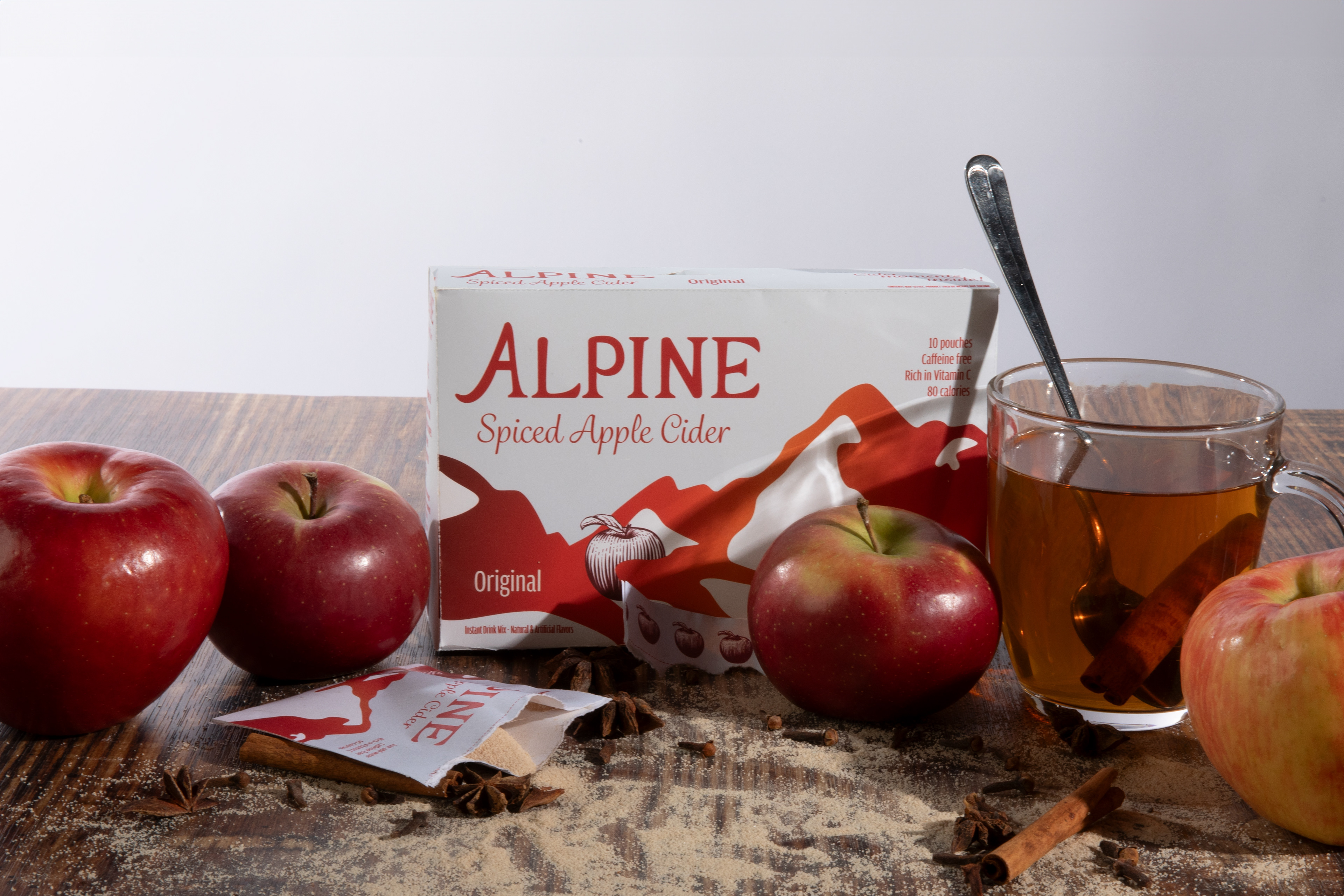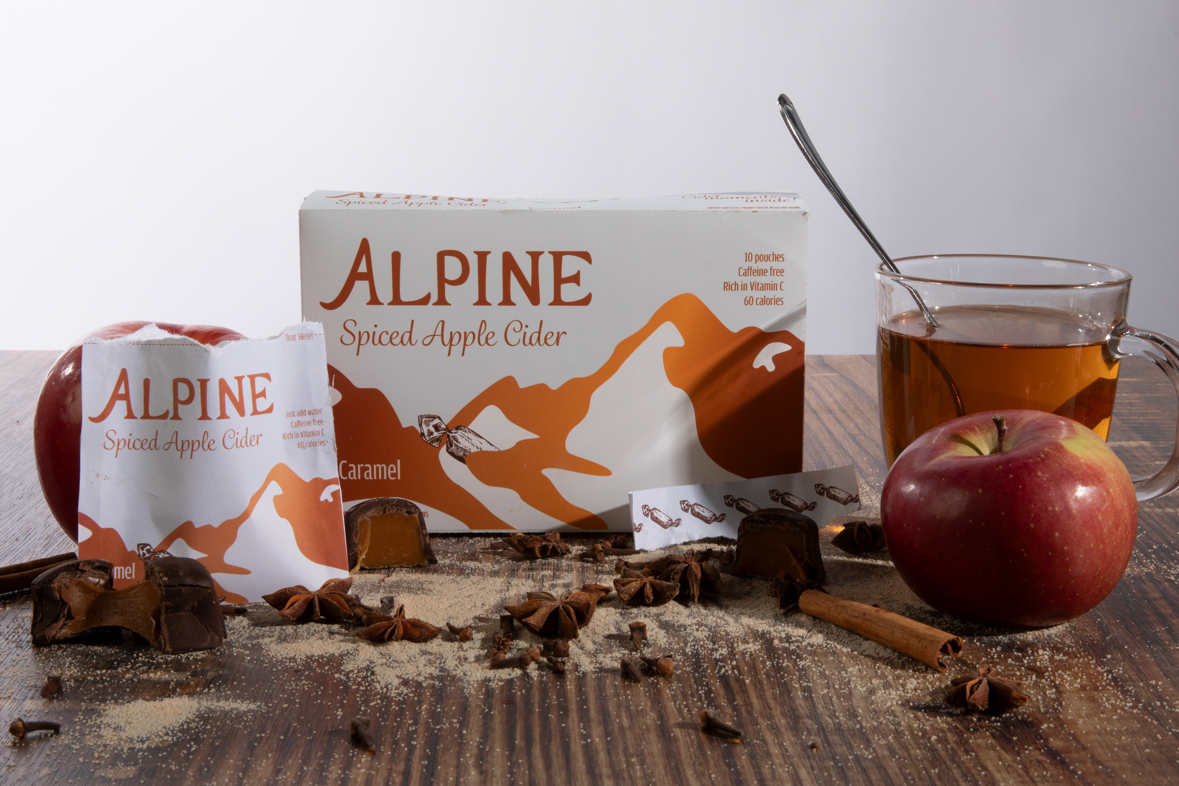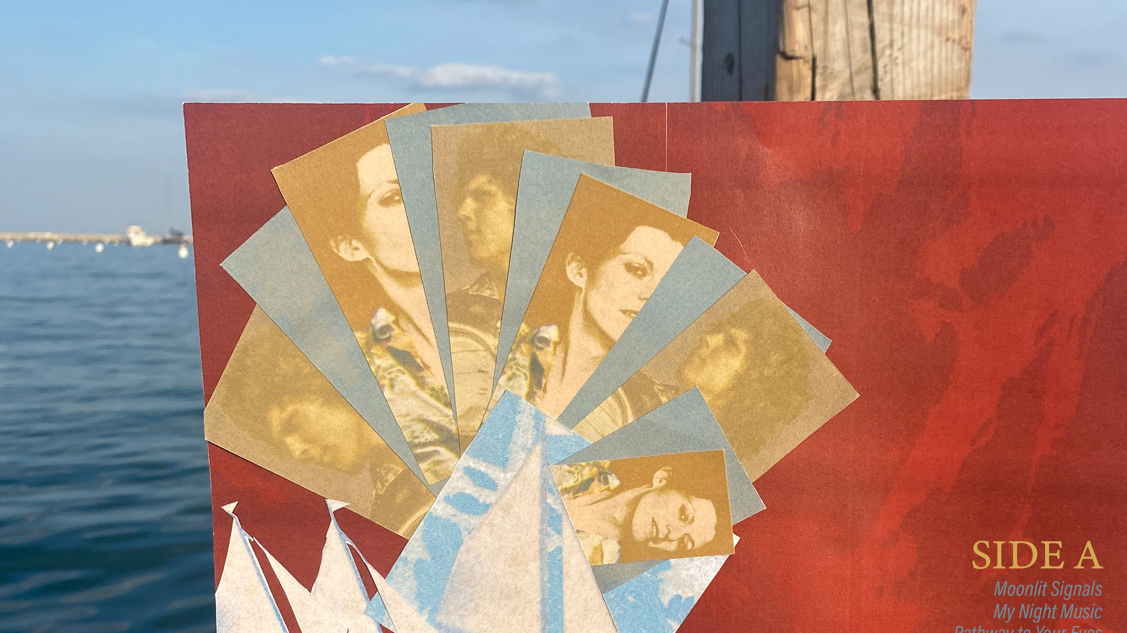

I redesigned the primary and secondary packaging for the classic ready-to-mix cider product, Alpine Spiced Apple Cider, which is owned by The Krusteaz Company.
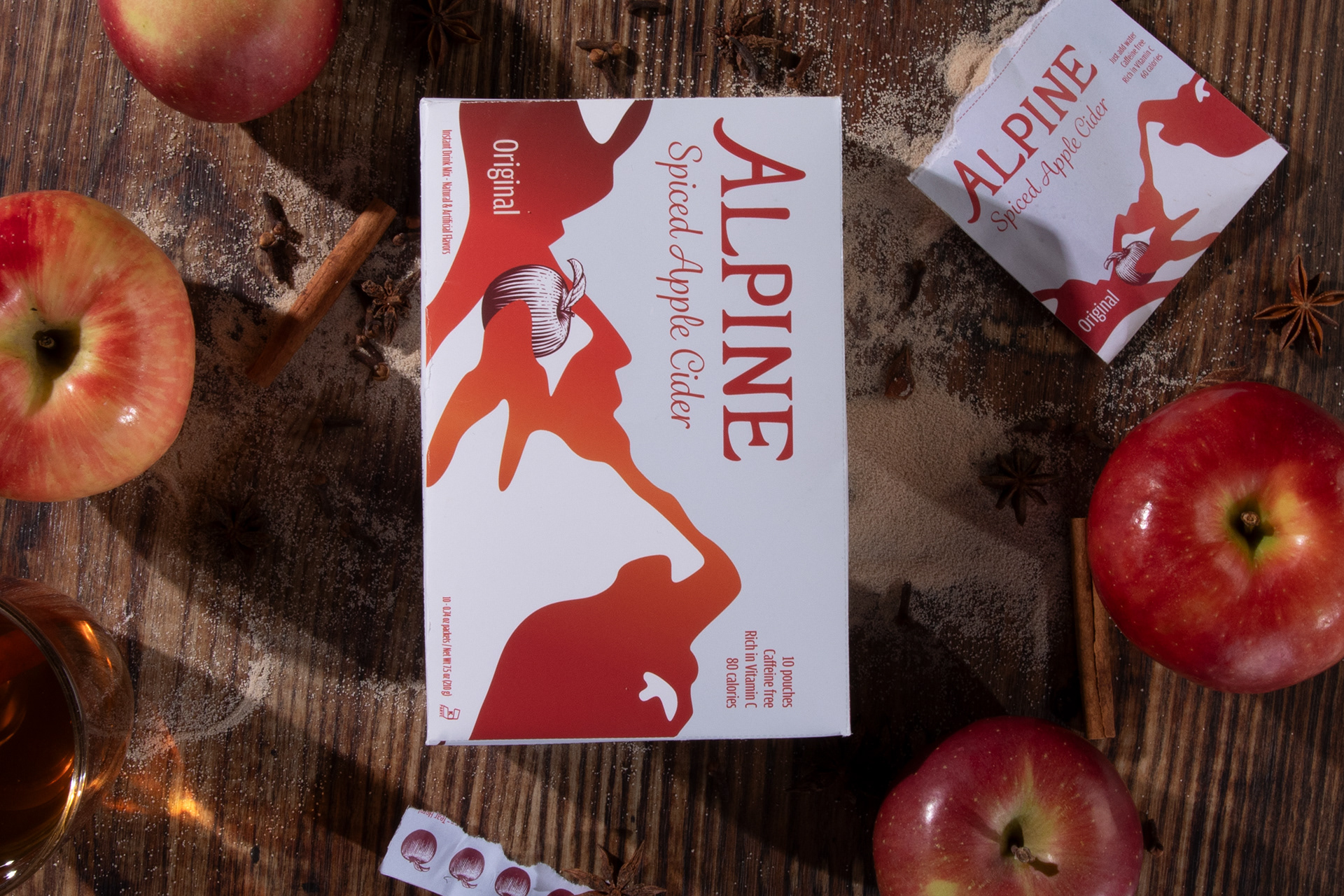
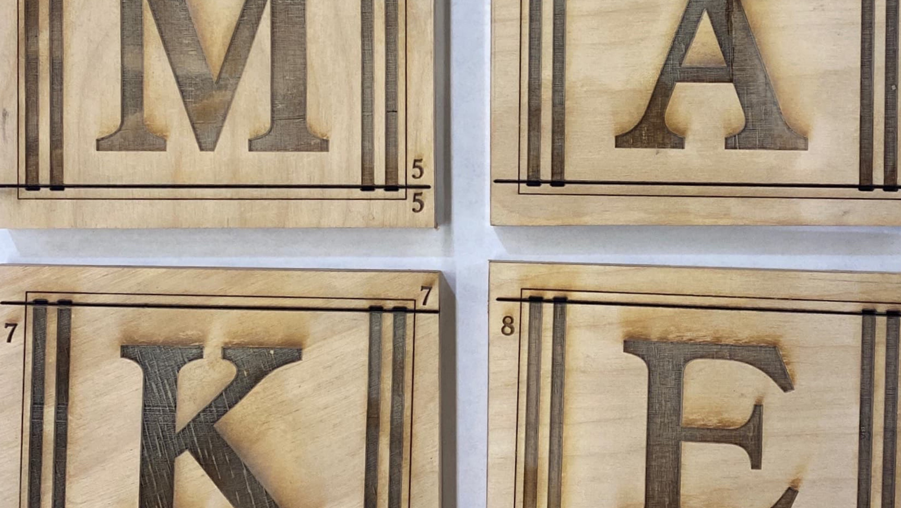
While I could not find much history on their current packaging, other than it being around since at least the early 2000s, I did find an image of old packaging from an unknown date, possibly 1970-1980, when the product was first released. I drew inspiration from the lettering used there for the logo redesign, which I drew by hand at first. I standardized the text using Adobe Illustrator.
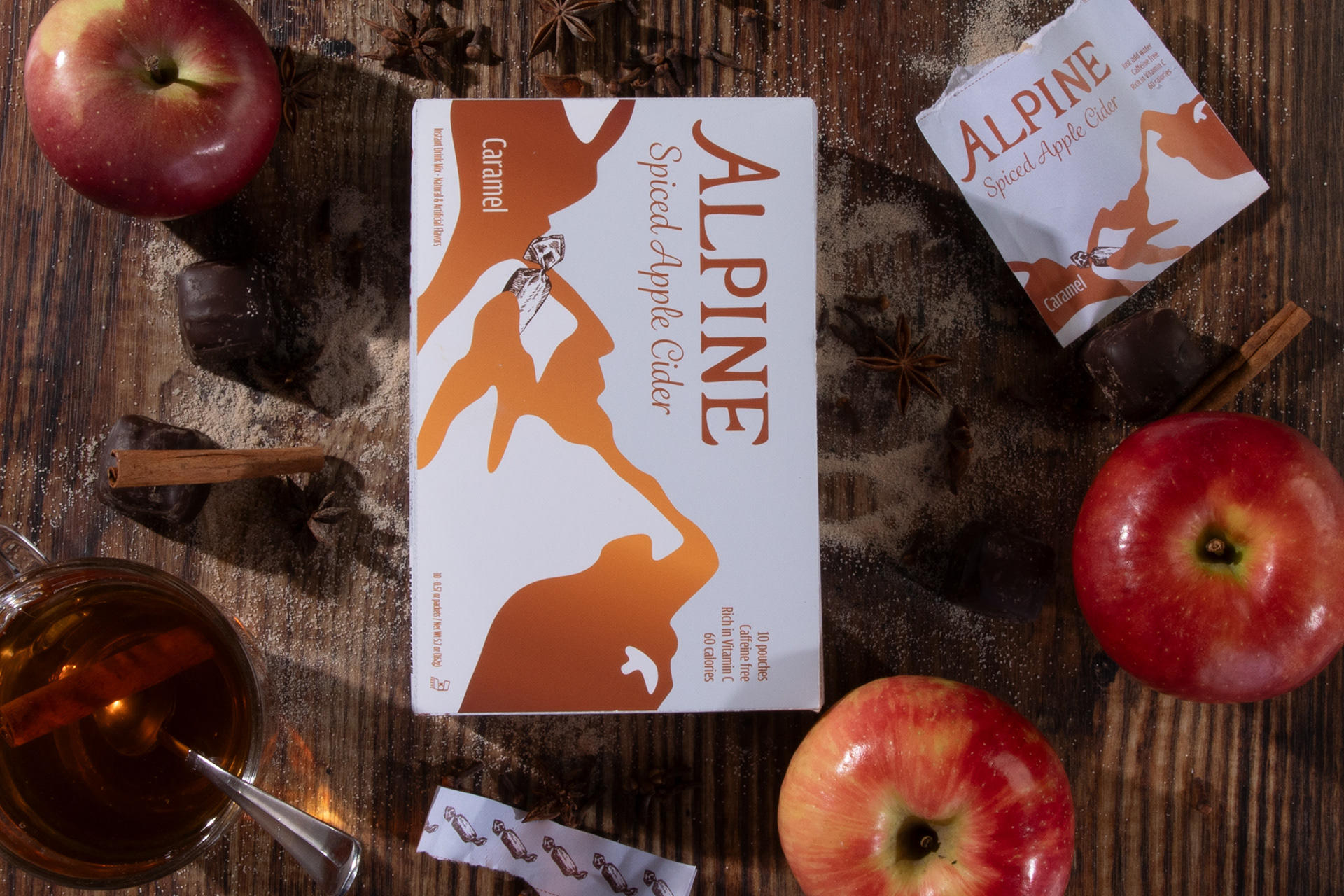
Building from there, I came up with a modern, cleaner take on the current packaging. I wanted to keep brand continuity by including the recognizable gradient, which sticks out from all the other hot chocolate, coffee, and tea mixes in the "warm drink" aisle at the grocery store.
I also enjoyed writing fresh copy from scratch on the packaging, updating what little body copy existed on the current packaging. I drew inspiration from hiking through big mountains for the first time recently, and researched the area of South Tyrol - a German-speaking part of Italy in the Alps that is famous for its export of apples.
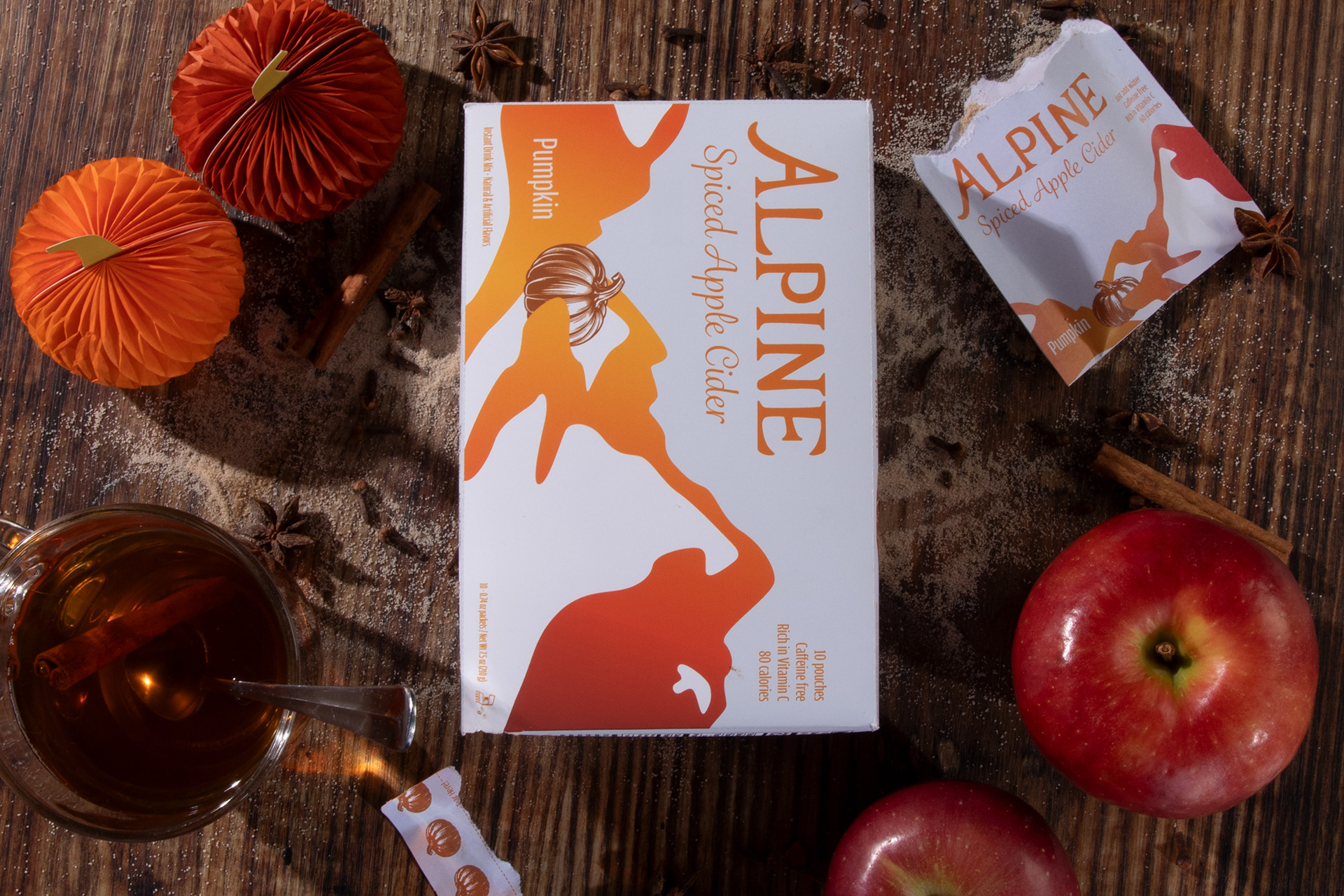
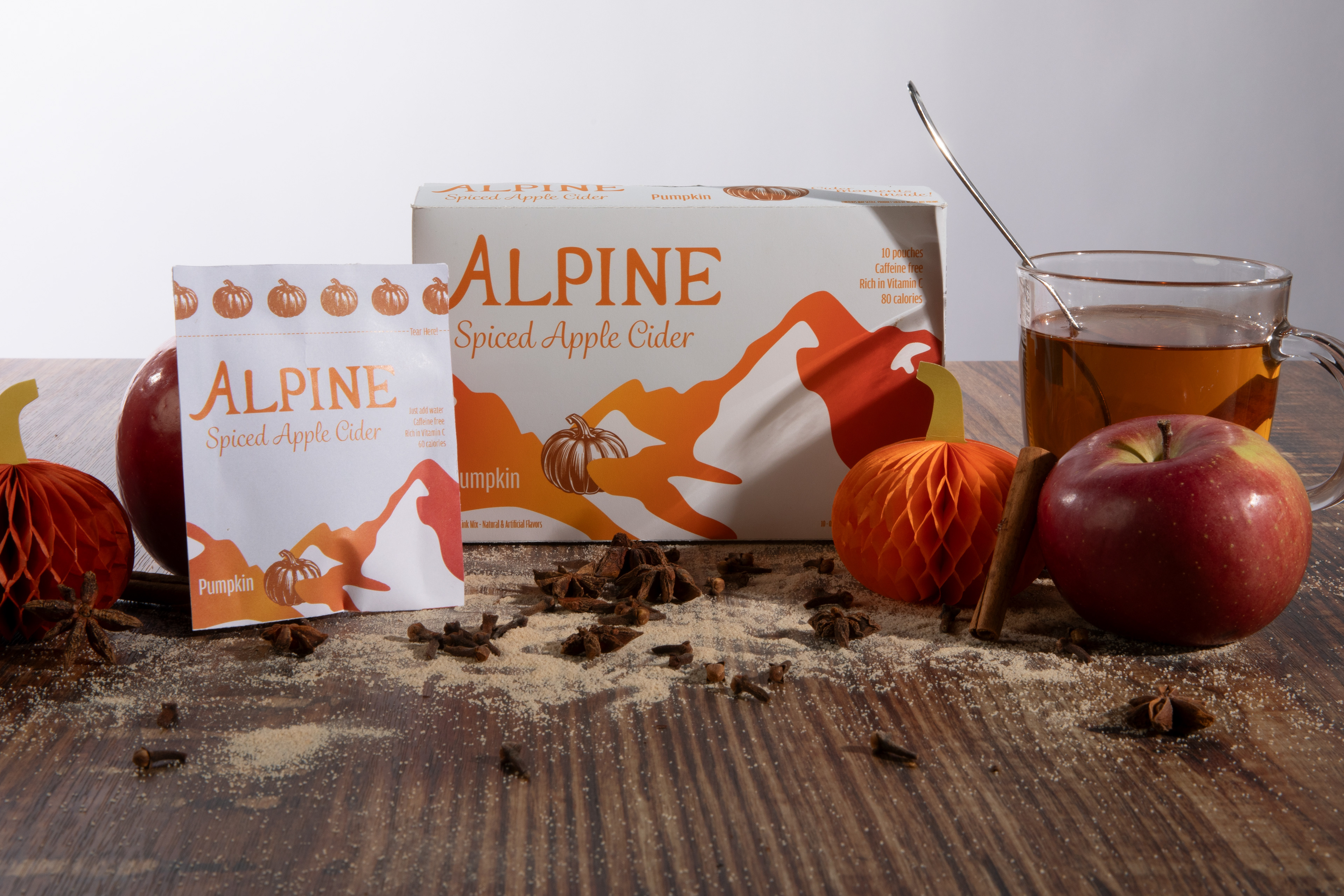
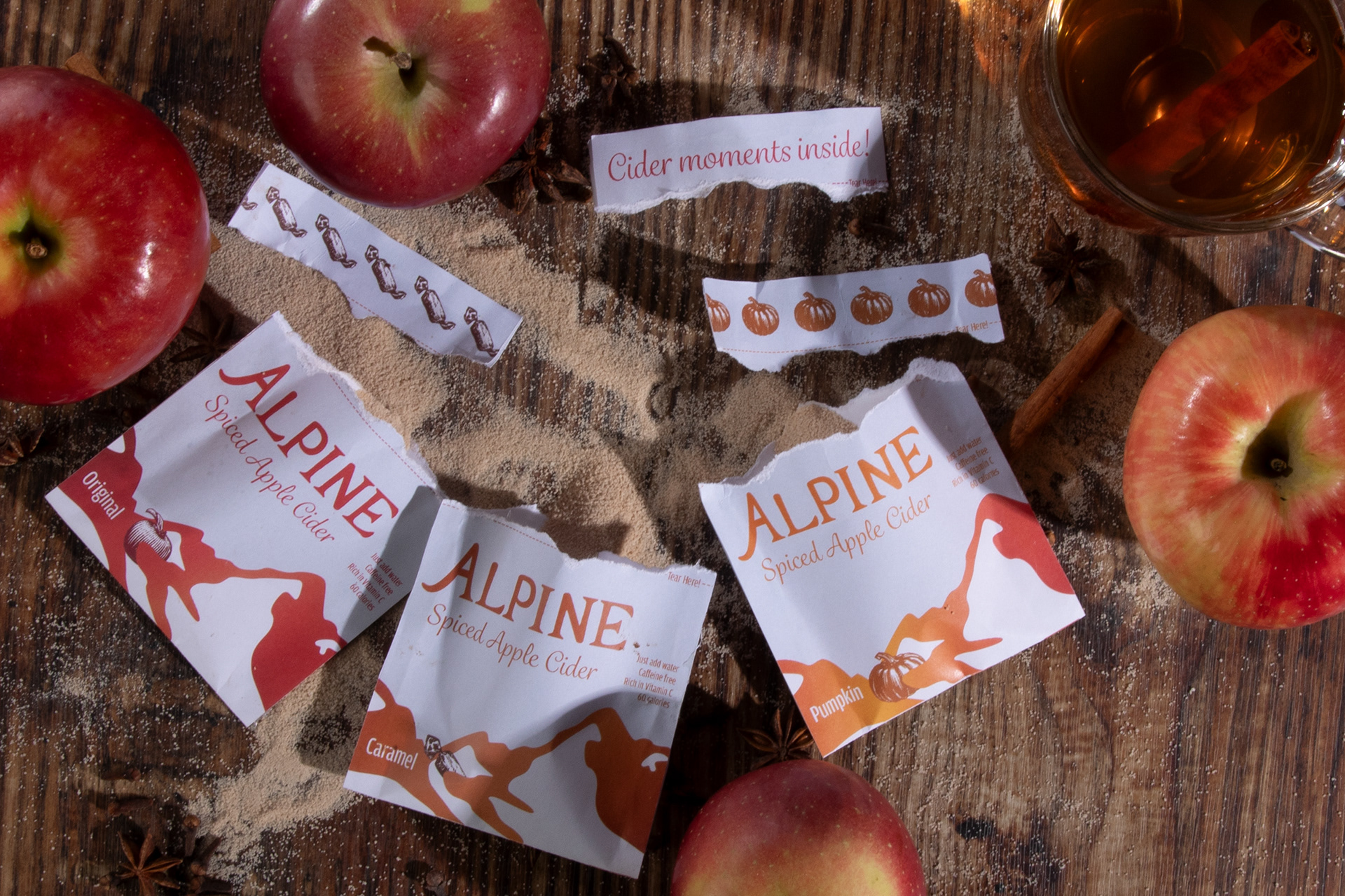
In the past, The Krusteaz Company has produced both Pumpkin and Caramel variations of this product, though only the Original, as well as a sugar-free version, can be acquired today. I used these additional flavors to demonstrate how the line could be extended - the brand identity would be kept consistent, while allowing customers to differentiate the packages on the shelf.