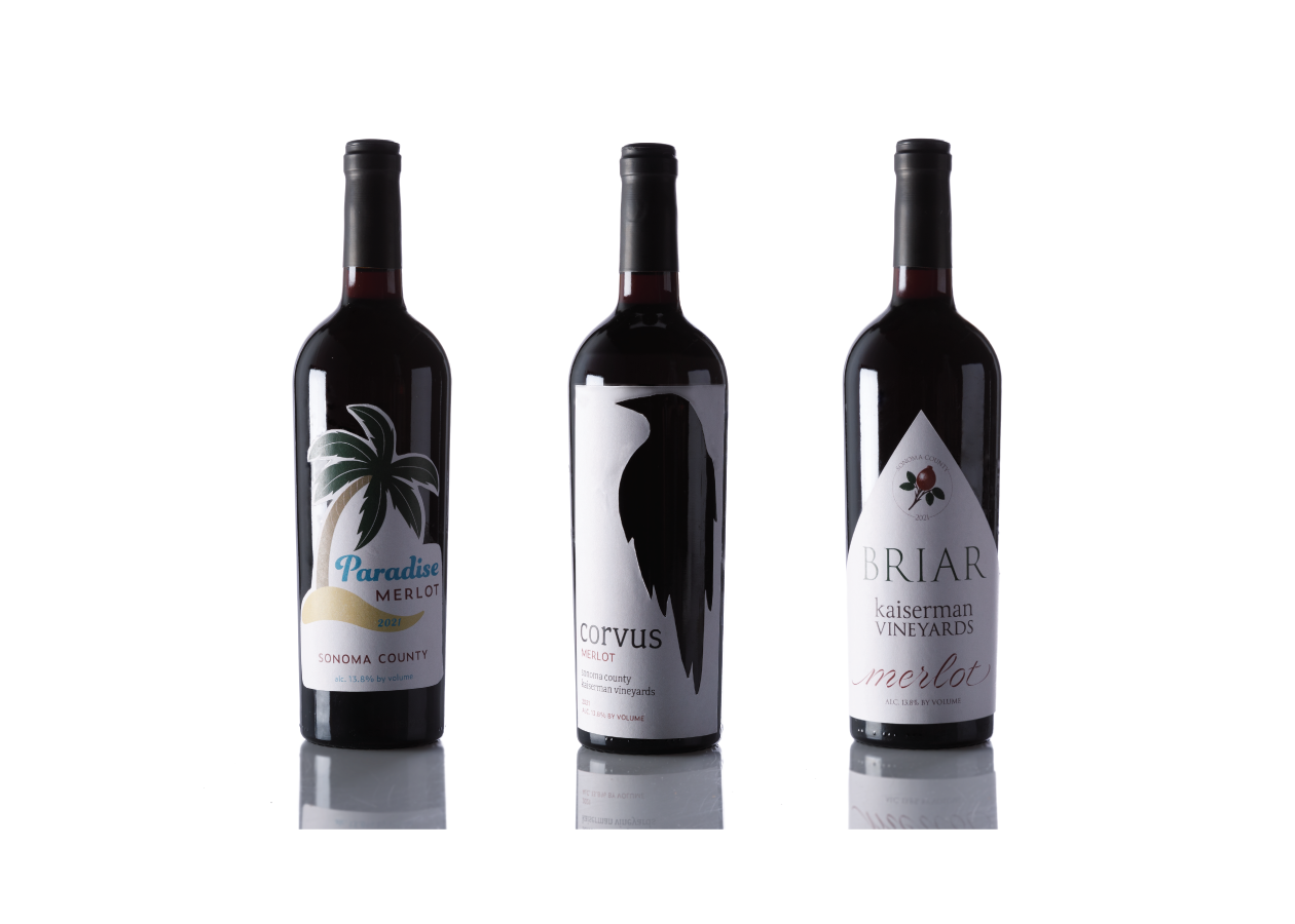
I created a series of wine bottle labels from scratch, focusing on establishing a cohesive lineup of offerings for my imaginary vineyard, Kaiserman Vineyards. I also prioritized creating eye-catching, unique designs that could fare in the competitive wine market.
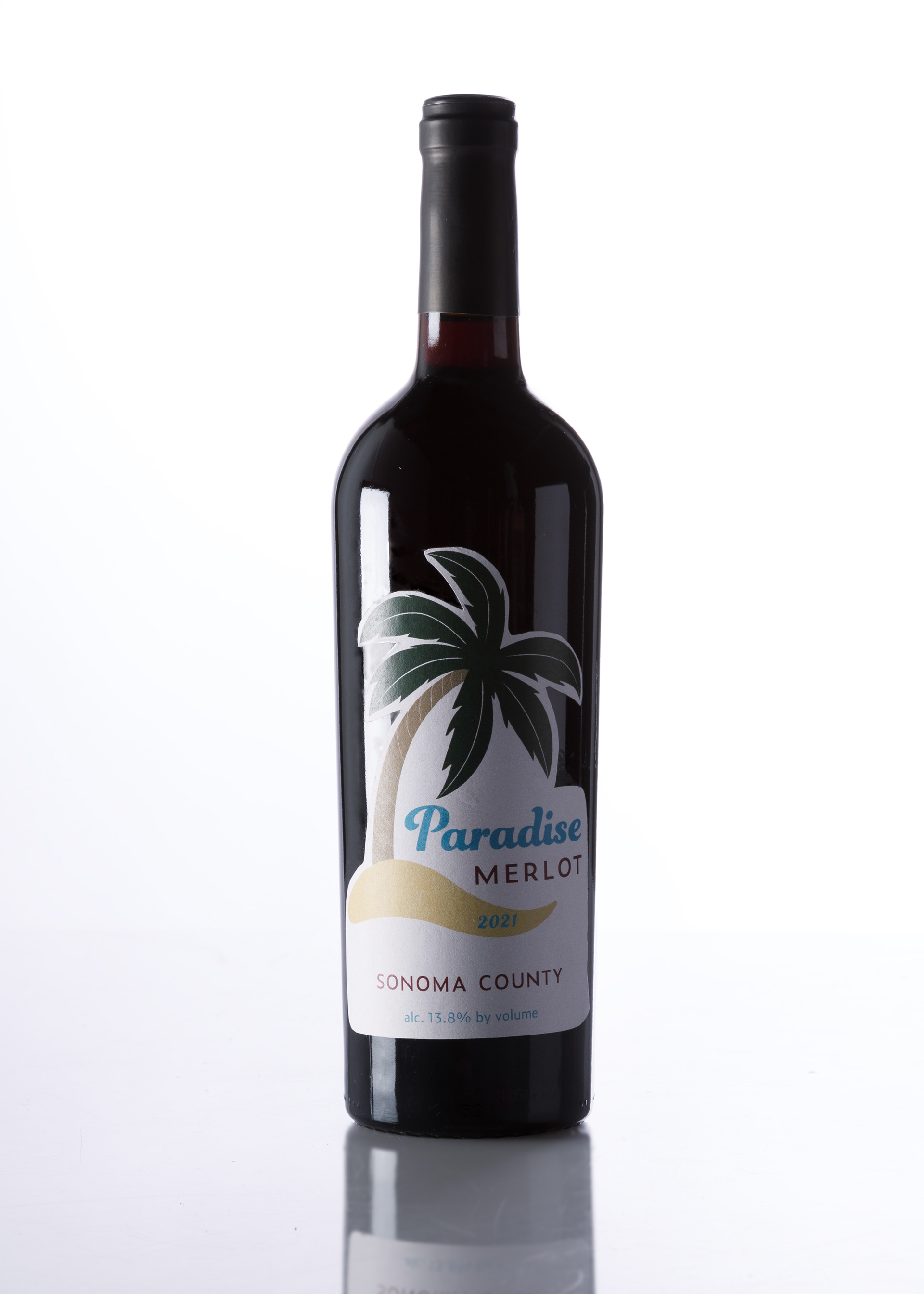
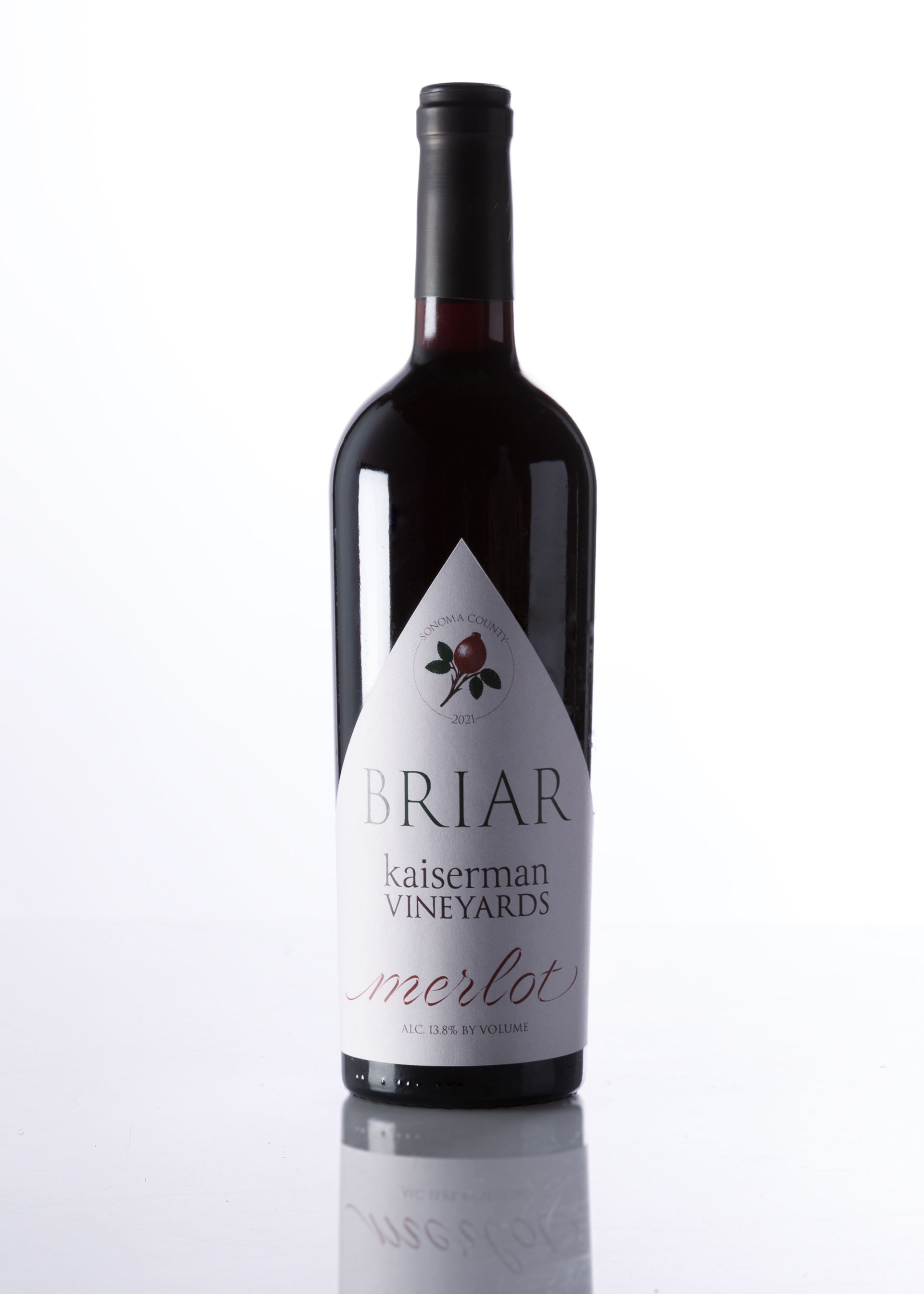
I conducted field research by browsing wines of various types at the nearby Wabash Liquors. This medium-to-high end liquor store in the Loop of Chicago provided a great template to gain inspiration. Wines from all over the world were represented, along with all types - merlots, cabarets, sauvignon blancs, bubbly prosecco and champagnes. In doing this research, I focused on merlot reds from California, looking for the design conventions they follow as a group, and how I could subtly carve my own space within them. There were also many price points of wine in all kinds, so I chose to develop three labels: a low, mid, and high-range bottle.
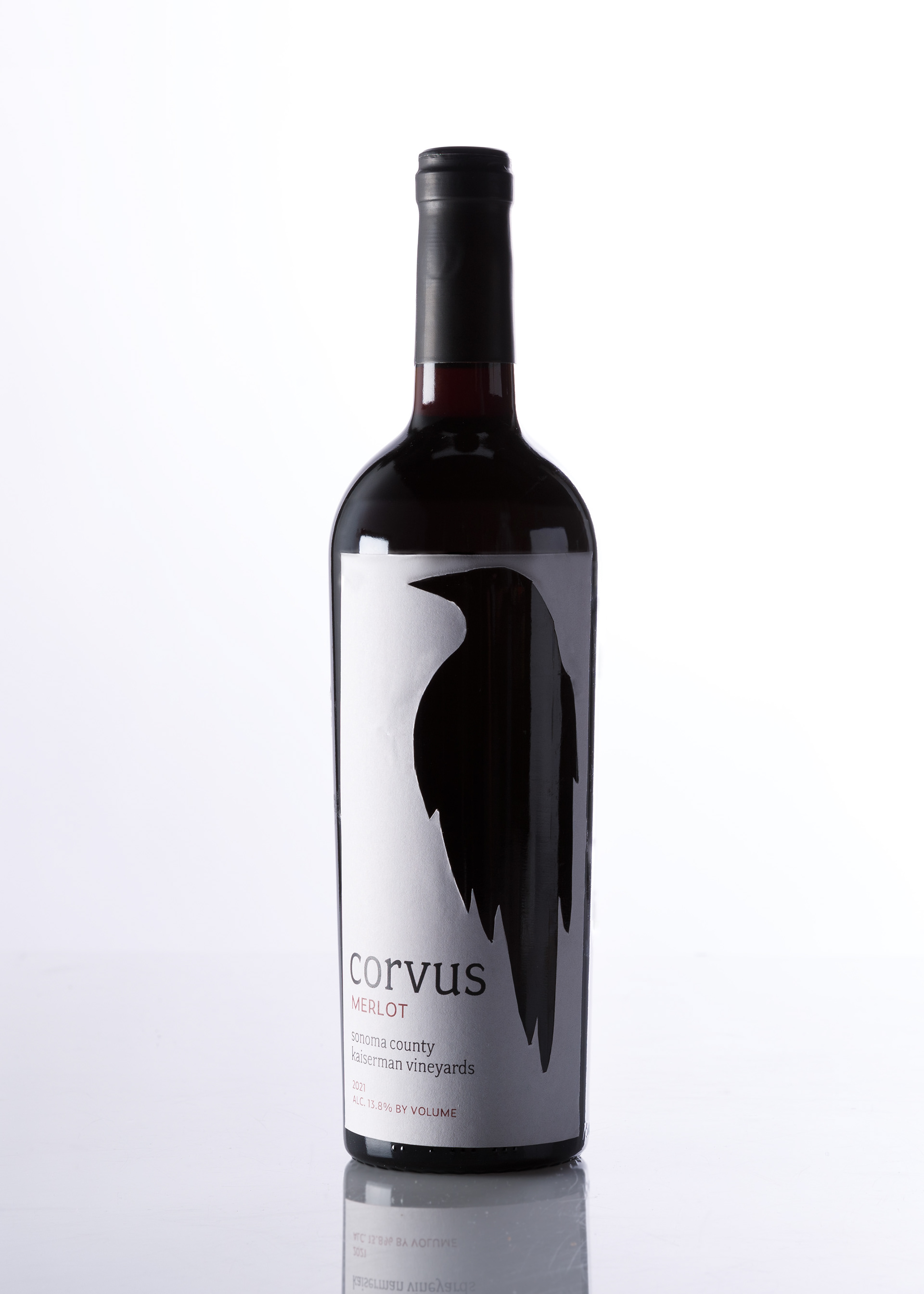
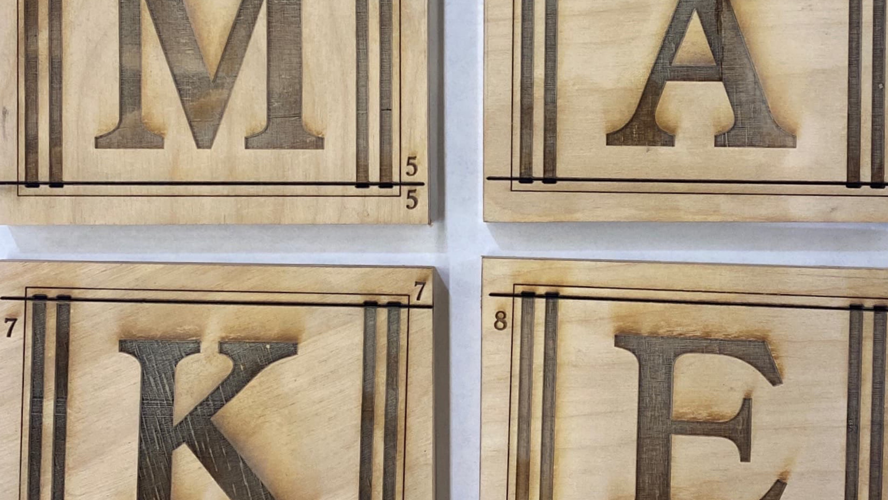
After filling a chunk of my camera roll with wine bottle photos, I sketched design ideas, filling in hand-drawn bottles with a black marker, getting a sense for how the lighter label would look on the glass background. I found myself drawn to die-cut labels - though the ones I saw at the liquor store were sometimes a little bit cheesy or too on the nose. I have personal experience using a Cricut cutting machine, as well as use of Columbia College's industrial laser cutters, and knew I could execute simple die-cuts on my own.
At this point, I had what I felt like was my breakthrough idea in this project - using the dark glass of the wine bottle in an interior die-cut. This was certainly thanks to my marker sketches - when I drew a raven shape within the white area reserved for the label and filled it in, it immediately jumped out as if it were part of the bottle.
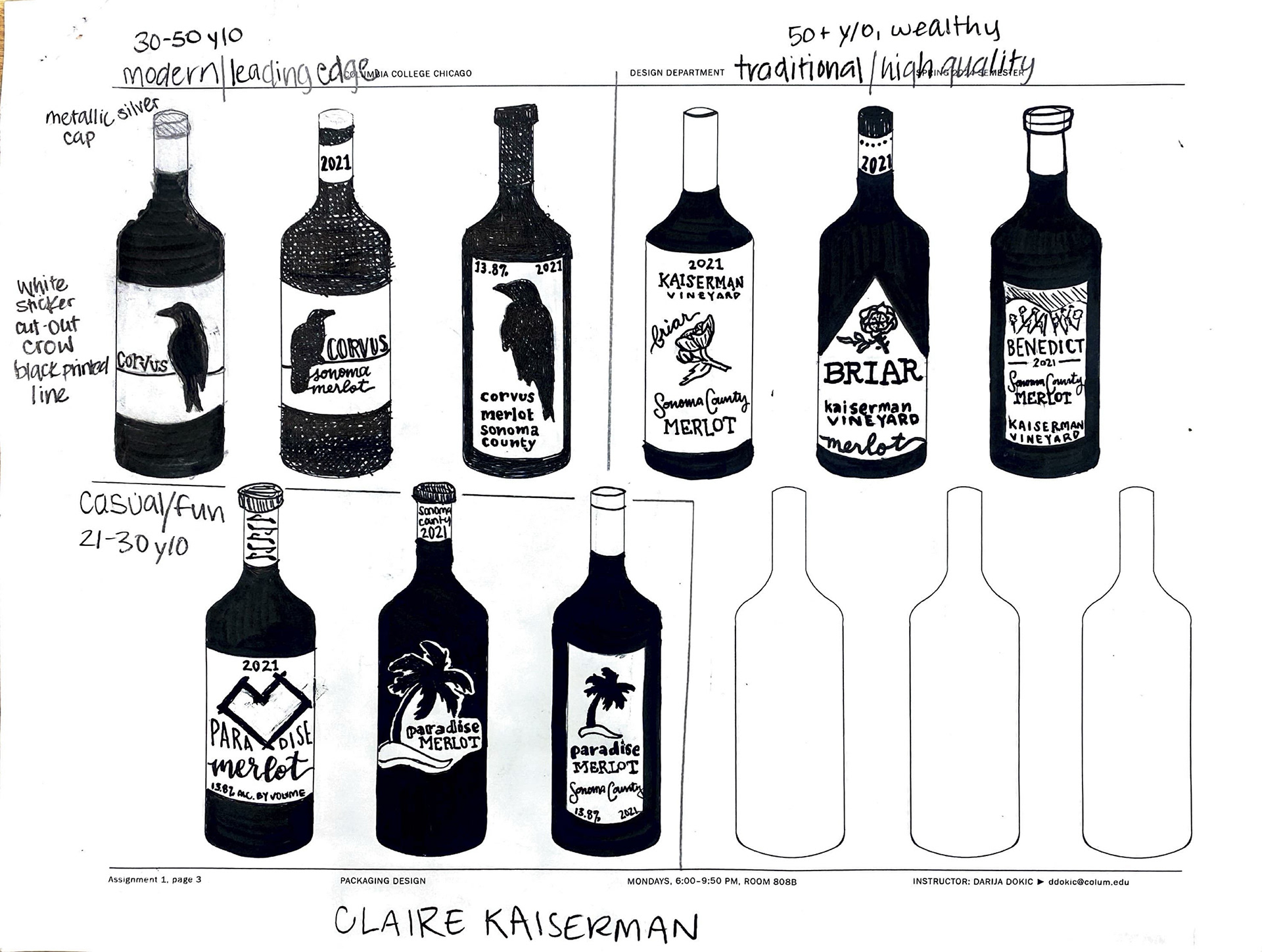
The three price-point bottles each had a different target audience, and therefore had different typography and color choices. A beige background of the same color was use on all three, to promote brand continuity - and to be realistic that I would likely print these on the same stock, if I was a wine producer. Some wine brands shy away from die-cuts as they can increase costs, or on the other hand, make upscale wines look cheap. If I was going to use an exterior and interior die-cut on my labels, and some non-square labels, it was likely that I would need to be efficient with my stock. Therefore, I did not simulate splurging for something fancier (in the label's paper weight, background design, cap design or added three-dimensional elements) on the medium and high end bottles.
I hoped to achieve vineyard, or brand, recognition when the bottles were displayed amongst others, while giving each variety its distinct personality within the family. I really enjoyed this first experience with packaging design!